Table of Contents (11 sections)
Color is a fundamental aspect of artistic photography, influencing emotions, storytelling, and the overall aesthetic. It can create harmony, tension, and drama within a photograph, which is crucial for engaging viewers. Understanding color theory is essential for photographers aiming to convey a mood or message. The interplay of colors can lead to striking compositions and can set a photograph apart in a saturated visual landscape.
Understanding Color Theory
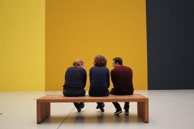
Color theory is a conceptual framework that explains how colors interact with one another. The traditional color wheel includes primary colors (red, blue, and yellow), secondary colors (green, orange, and purple), and tertiary colors. In photography, applying concepts such as complementary colors—colors opposite each other on the wheel—can enhance contrasts and draw attention to focal points. For example, combining blue and orange can create a dynamic visual impact, often used in landscape photography.
Moreover, color psychology plays a pivotal role in how colors evoke certain feelings. Red can signify passion and urgency, whereas blue often evokes calmness and serenity. Photographers should consider their audience's perception of color when composing images to elicit the desired emotional response.
Practical Tips for Using Color in Photography
When capturing images, identifying a color scheme can provide direction. Here are some practical tips:
- Plan Your Color Palette: Before heading out to shoot, consider the colors in your environment. Researching the location can help you understand what colors dominate the scenery and how best to portray them in your compositions.
- Utilize Natural Light: Light significantly influences color. The golden hour—just after sunrise and before sunset—softens light, enhancing warm tones. Conversely, harsh midday sun can wash out colors. Therefore, choosing the right time of day can lead to more vibrant images.
- Post-Processing Adjustments: Software like Adobe Lightroom or Photoshop allows you to manipulate color in post-processing. Adjusting the hue, saturation, and luminance can make a significant difference, allowing you to stay true to your original vision or alter the mood of the image.
Color Combinations That Work
Understanding which colors work well together can enhance your photography. Here’s a comparison of popular color combinations:
| Color Combo | Visual Impact | Emotional Response | Best Usage |
|---|---|---|---|
| Red & Blue | High Contrast | Energy + Calm | Portraits |
| Yellow & Purple | Vibrant & Fun | Happiness | Street Photography |
| Green & Brown | Earthy & Natural | Stability | Landscapes |
| Black & White | Classic | Timelessness | Portraits |
Expert Insights on Color Usage
> 💡 Expert Opinion: According to photographer Annie Leibovitz, "Color is an important emotional aspect of visual storytelling. Our brains are wired to respond to color, and savvy photographers must use that to their advantage. Different colors evoke different wavelengths of emotion; thus, they can transform a mundane photo into a compelling narrative." This insight highlights the importance of intentionality with colors to boost the overall impact of photographic work.
The Importance of Color in Composition
The balance of color within a photo contributes significantly to composition. A well-composed photograph often utilizes the principle of color distribution to create harmony. When colors are evenly spaced and interact positively, viewers' eyes navigate the image naturally. For example, if a photo has a dominant color, complementary accents can draw eyes back to the center and guide viewers through the image.
Frequently Asked Questions (FAQ)
- What is the importance of color in artistic photography?
Color influences emotions and perceptions, playing a key role in storytelling and composition.
- How can I improve my use of color in photography?
Experiment with different color combinations, practice color theory, and utilize image editing technologies.
- What are some common color palettes in photography?
Popular palettes include monochromatic, complementary, and analogous schemes, each evoking different feelings.
- How does lighting affect colors in photographs?
Different lighting conditions can dramatically change how colors appear, influencing mood and detail.
Glossary
| Term | Definition |
|---|---|
| Color Theory | A framework for understanding color interactions. |
| Complementary Colors | Colors located opposite on the color wheel, enhancing visual impact. |
| Monochromatic Palette | A color scheme using varying shades of a single color. |
Checklist for Using Color in Photography
- [ ] Understand color theory basics.
- [ ] Plan your color palette before shooting.
- [ ] Consider the time of day when shooting.
- [ ] Experiment with post-processing techniques.
- [ ] Analyze and reflect on emotional responses to colors.
📺 For Further Exploration:
[Explore the Dynamics of Color in Photography], a deep dive into color usage in photography. Search on YouTube: "how color affects photography techniques".
Recommended Products
- Product 1: A framed wall art piece that serves as a visual study in contrasting colors, perfect for inspiration.
- Product 2: Liquid blush that exemplifies vibrant colors and long-lasting pigmentation, useful for defining and enhancing portrait themes.
- Product 3: A carefully curated range of blush shades which evokes a natural glow, ideal when aiming for softness in portrait photography.
The art of using color in artistic photography not only enhances the visual essence of your work but also allows you to communicate more profoundly with your audience. Implementing these techniques can significantly elevate your photography.
📺 Pour aller plus loin : how color affects photography techniques sur YouTube
Recommended products
Selected by our experts
'Quarto 1' Framed Wall Art 24''x24'' by Ackerman
cb2.com
This framed wall art piece serves as a visual study in contrasting colors, perfect for inspiration.

Surratt Artistique Liquid Blush Cantaloup
bluemercury.com
This liquid blush exemplifies vibrant colors and long-lasting pigmentation, useful for defining and enhancing portrait themes.

Surratt Artistique Blush La Rosee du Soir
bluemercury.com
A carefully curated range of blush shades that evoke a natural glow, ideal when aiming for softness in portrait photography.