Table of Contents (12 sections)
Color is a vital element in artistic photography, influencing emotions and perceptions. Understanding color theory allows photographers to create compelling images that resonate with viewers. From color harmony to contrast, each choice can significantly impact the aesthetic and emotional quality of an image.
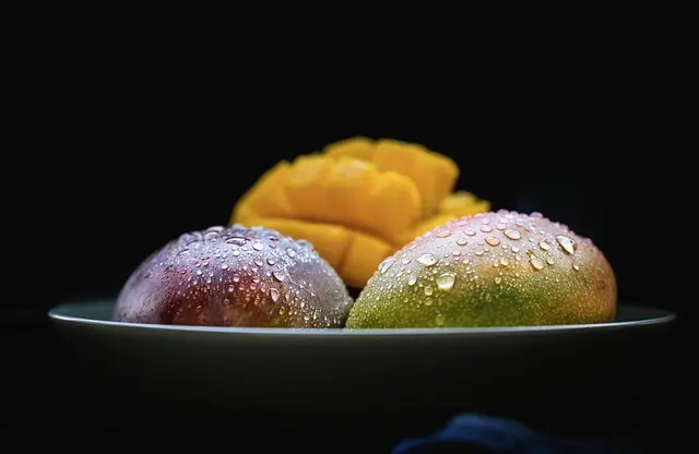
Color theory involves a color wheel and various schemes, including complementary, analogous, and triadic options. Complementary colors, such as blue and orange, create a strong contrast, attracting attention and emphasizing subjects. In contrast, analogous colors, like blue, blue-green, and green, provide a more soothing and harmonious appearance. By leveraging these principles, photographers can evoke desired emotions and convey narratives in their work.
In 2026, the relevance of color theory in photography continues to grow. As visual complexity increases in a saturated digital market, distinguishing one’s work becomes essential. Effective use of color not only enhances the attractiveness of the photograph but can also act as a storytelling device. Studies show that images perceived as vibrant or well-composed regularly have higher engagement rates on social media platforms.
By mastering color theory, photographers can ensure their art expresses a clear message while attracting and engaging their audience effectively.
Understanding Key Concepts in Color Theory
Delving deeper into color theory reveals several key concepts every photographer should know. The color wheel is a circular diagram that represents the relationship between colors. Primary colors (red, blue, yellow) are combined to create secondary colors (green, orange, purple). This foundational knowledge is crucial for photographers aiming to build color palettes for their compositions.
Color harmony, referring to pleasing arrangements of colors, is another fundamental aspect. Harmonious colors enhance the viewer's experience by creating balance and cohesion within the frame. For example, a photograph featuring sunsets often uses warm colors that harmonize with each other, generating emotional comfort and nostalgia. On the other hand, color contrast, which pairs opposing hues or intensities, can create dramatic effects and focus attention on specific elements. Using contrast effectively helps guide the viewer’s gaze, making it critical in scenes where subjects compete for attention.
Another concept is the psychological impact of colors. Photographers must understand that different colors evoke specific emotions. For instance, blue often symbolizes calmness or trust, while red can convey passion or urgency. Knowing how to play with these colors strategically influences the message of an artwork, ultimately elevating viewer engagement.
By integrating these key concepts into their practice, photographers can enhance their creative process and produce images that speak powerfully to their audiences.
Practical Application of Color Theory in Photography
Applying color theory to photography involves intentional decision-making throughout the capturing process. Photographers should consider color while composing an image, carefully selecting subjects that enhance their desired aesthetic. For example, landscape photographers often use natural light during the golden hour to capture warm, golden hues, effectively employing color harmony.
When taking portraits, backgrounds play a critical role. Choosing a background that contrasts or complements the subject's colors not only defines the subject but also adds depth to the composition. A study by the American Photographic Association found that visually striking portraits often utilized high color contrast, enhancing the image’s emotional pull and storytelling quality. The skillful integration of color theory underscores the significance of thoughtful location and styling choices in portrait photography.
Moreover, post-processing techniques can also enhance the effectiveness of color in images. Software like Adobe Lightroom and Photoshop allows photographers to adjust hues, saturation, and tonal ranges, facilitating the creation of a desired mood. Subtle tweaks can harmonize an image or emphasize specific elements, further illustrating the photographer's artistic vision.
In implementing color theory, photographers are not confined to their techniques during capture alone. Strategic post-processing can enhance initial efforts, resulting in photographs that truly stand out.


Color Theory Comparative Analysis
To better understand how different color schemes affect artistic photography, let’s compare three common approaches: complementary, analogous, and triadic.
| Color Scheme | Example | Strengths | Challenges |
|---|---|---|---|
| Complementary | Red & Green | High contrast, dynamic impact | May clash if overused |
| Analogous | Yellow, Orange, Red | Harmonious and soothing | Can be less striking |
| Triadic | Blue, Red, Yellow | Balanced, vibrant compositions | Requires skill to coordinate |
Overall, understanding these comparisons aids photographers in selecting the appropriate color strategy tailored for the subject matter, emotional intent, and audience engagement.
📺 Ressource Vidéo
> 📺 Pour aller plus loin : Exploring Color Theory in Photography, a comprehensive guide to utilize color effectively in creative works. Recherchez sur YouTube : "color theory in photography 2026".
Frequently Asked Questions (FAQ)
What is the role of color theory in photography?
Color theory helps photographers understand how to use color effectively to communicate emotions and attract viewers.
How can I apply color theory to my photography?
You can apply color theory through composition decisions, background selection, and post-processing techniques that enhance your chosen color scheme.
What are complementary colors?
Complementary colors are colors opposite each other on the color wheel, providing high contrast and visual interest when used together.
How does color impact viewer emotions?
Different colors evoke specific feelings; for example, warm colors often convey energy and excitement, while cool colors tend to impart calmness and trust.
Glossaire
| Terme | Définition |
|---|---|
| Couleur complémentaire | Couleurs opposées sur la roue chromatique, créant un fort contraste. |
| Harmonisation des couleurs | Agencement agréable des couleurs, apportant équilibre et cohésion. |
| Impact psychologique | Influence des couleurs sur les émotions et réactions des spectateurs. |
Checklist avant achat
- [ ] Choisir la palette de couleurs
- [ ] Vérifier l'éclairage naturel
- [ ] Évaluer les contrastes
- [ ] Analyser la composition
- [ ] Planifier la post-production
💡 Avis d'expert : "Maîtriser la théorie des couleurs est essentiel pour quiconque souhaite créer des images percutantes et intemporelles."
En intégrant ces éléments, les photographes augmentent leurs compétences, réalisant ainsi des photographies artistiques qui éveillent l’intérêt et la beauté. En mettant en œuvre une approche réfléchie, ils peuvent ouvrir de nouvelles perspectives visuelles tout en inspirant et en captivant le public.
N’hésitez pas à explorer nos recommandations ci-dessous qui pourraient enrichir votre pratique photographique.
📺 Pour aller plus loin : color theory in photography 2026 sur YouTube
Recommended products
Selected by our experts
'Quarto 1' Framed Wall Art 24''x24'' by Ackerman
cb2.com
This framed wall art can inspire photographers with its vibrant color contrasts and artistic interpretation.
Surratt Artistique Liquid Blush Cantaloup
bluemercury.com
Introducing this liquid blush can inspire color choices in photography, influencing palettes and moods.
Surratt Artistique Blush La Rosee du Soir
bluemercury.com
This blush provides insight into subtle color applications, ideal for capturing elements in portrait photography.