Table of Contents (15 sections)
Understanding Color Theory
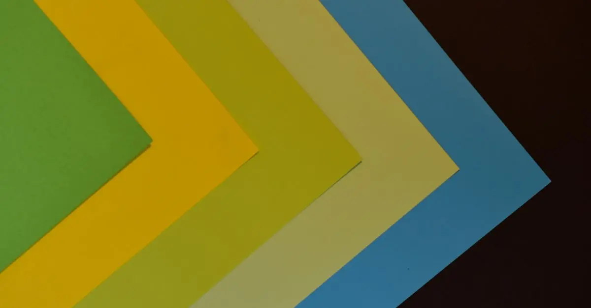
Color theory is a cornerstone of visual arts, including artistic photography. It encompasses the science of how colors interact and how they can be effectively used to elicit emotional responses. At its core, color theory studies the color wheel, which includes primary, secondary, and tertiary colors. This wheel helps photographers understand complementary colors, analogous colors, and triadic color schemes. For instance, complementary colors—like blue and orange—create strong contrasts, enhancing the visual appeal of photographs.
Furthermore, psychological studies highlight how colors influence mood. For example, warm colors such as red and yellow can evoke warmth and energy, while cooler colors like blue and green tend to be calming. Understanding these principles enables photographers to make conscious choices in their work. Artists can create harmony or tension in images simply through color use, enhancing storytelling elements in their photographs.
Incorporating Color Into Your Shots
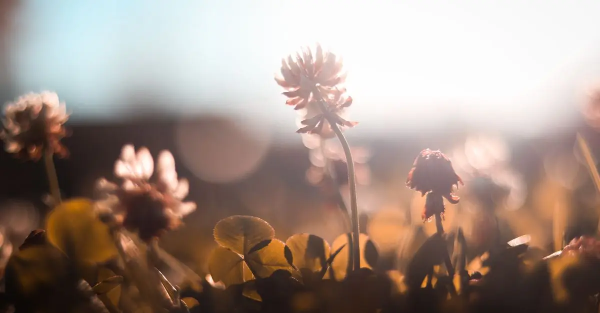
To effectively use color in your pictures, start by selecting a well-defined color palette. This step involves selecting colors that complement and contrast well within the frame. For instance, if shooting in nature, the greens and browns can be highlighted using pops of color from wildflowers. Always consider the subject matter; for instance, yellow against lush greenery can create a focal point that draws the eye.
Next, utilize natural light wisely. The time of day significantly affects how colors are perceived. The golden hour—just after sunrise and before sunset—can soften colors, providing a warm glow that enhances landscapes and portraits alike. Additionally, consider using neutral backdrops, which can make accent colors pop, emphasizing the subject of the photograph without distraction.
Meanwhile, pay attention to color harmony. Research shows that maintaining a balance of colors that are either analogous or complementary can create aesthetically pleasing compositions. By combining techniques such as layering colors and strategically placing elements within the frame, photographers can guide viewers' eyes throughout the image.


Analyzing Color in Photography
Color analysis is vital in post-processing during digital photography. Tools like Adobe Lightroom and Photoshop offer comprehensive options for color grading and adjustments. Understanding the RGB (Red, Green, Blue) and CMYK (Cyan, Magenta, Yellow, Key Black) color models aids in making informed decisions about enhancing images.
Using color theory during editing allows for fine-tuning the emotional tone of the photograph. Some photographers prefer warmer tones to convey a sense of nostalgia while others may opt for cooler tones to produce a contemporary feel. An important statistic to consider is that images with strong color contrasts are 80% more likely to grab attention compared to those with dull tones. This shows the necessity of effective color manipulation in compelling photographic work.
Example Color Combinations:
| Color Scheme | Examples | Use Cases | Visual Impact |
|---|---|---|---|
| Complementary | Red & Green | Vibrant product shots | Creates tension |
| Analogous | Blue, Blue-Green | Serene landscapes | Offers tranquility |
| Triadic | Red, Yellow, Blue | Dynamic portraits | Adds energy |
| Monochromatic | Different shades of Blue | Minimalistic settings | Provides harmony |
Color Palette Selection
Selecting a color palette specific to your artistic intent is useful for crafting images that resonate. Consider themes like seasonality or mood. For example, pastel shades can evoke spring vibes, while rich, jewel-toned palettes may suggest luxury or opulence.
You can draw color inspiration from various sources, such as nature, art, or even current design trends. Websites like Adobe Color and Coolors can help generate customizable color palettes based on your chosen vibe. Be sure also to conduct test shots to practice how different colors translate on camera.
Using a color palette checklist can aid in ensuring color consistency across shots, especially for series or themed work. Here are some colors to consider when crafting your palette:
- Foremost Colors: Choose 2-3 primary colors that represent the theme.
- Accent Colors: Select a few accent colors for highlights.
- Neutrals: Include 1-2 neutral colors for balance.
Avoiding Common Mistakes
As you delve into the art of color theory, it's imperative to avoid common pitfalls. One frequent mistake is overcrowding a photograph with too many contrasting colors, resulting in visual chaos rather than harmony. Keep in mind that less can be more; simplicity often leads to stronger compositions.
Another common error is neglecting the lighting conditions. Colors can appear drastically different under various lighting scenarios. Test your shots in changing light and adjust your settings accordingly to avoid unwanted discrepancies during editing.
Lastly, always remember to take advantage of color theory in post-processing. Adjusting contrast, saturation, and brightness can significantly influence the final image. Misuse of these post-editing tools, however, can lead to unrealistic colors, distorting the essence of your work. Practice moderation and train your eye to keep colors true to life.
Frequently Asked Questions
What is color theory in photography?
Color theory in photography involves understanding how colors interact and how they can evoke emotional responses, enhancing the overall impact of images.
How can I enhance colors in my photography?
You can enhance colors through careful selection of color palettes, understanding lighting conditions, and utilizing post-processing tools to manipulate colors effectively.
Why is color important in artistic photography?
Color plays a critical role in artistic photography as it can influence the mood, focus, and overall aesthetic of an image, transforming the visual narrative.
What are some common mistakes when using color in photography?
Common mistakes include overloading the image with too many colors, failing to account for lighting variations, and improperly processing colors during editing.
Glossaire
| Terme | Définition |
|---|---|
| Palette de couleurs | Un ensemble de couleurs choisies pour un projet artistique. |
| Harmonie des couleurs | L'utilisation de couleurs qui se complètent ou se contrastent efficacement. |
| Saturation | L'intensité ou la vivacité d'une couleur dans une image. |
Checklist avant achat
- [ ] Explore color palettes for consistency.
- [ ] Test shoot under various lighting conditions.
- [ ] Analyze color interactions in post-processing.
- [ ] Keep an eye on common color mistakes.
- [ ] Experiment with monochromatic and complementary palettes.
📺 Pour aller plus loin :
Artistic Photography and Color Theory, a complete analysis of techniques and methods to elevate your photographic skills. Recherchez sur YouTube : "color theory in photography 2026".
🧠 Quiz rapide : What is the importance of color theory in photography?
- A) It prevents poor lighting.
- B) It helps create emotional connections through color.
- C) It simplifies the editing process.
Réponse : B — Understanding color theory enables photographers to evoke emotions and enhance visual storytelling.
📺 Pour aller plus loin : color theory in photography 2026 sur YouTube
Recommended products
Selected by our experts
'Quarto 1' Framed Wall Art 24''x24'' by Ackerman
cb2.com
This framed wall art can inspire your color choices and composition techniques, making it an excellent addition to your creative workspace.
Surratt Artistique Liquid Blush Cantaloup
bluemercury.com
The liquid blush colors featured here can serve as a vibrant color palette inspiration for portrait photography.
Surratt Artistique Blush La Rosee du Soir
bluemercury.com
This blush range offers subtle shades ideal for reflecting natural hues in your photography, enhancing the overall aesthetic.