Table of Contents (11 sections)
Color plays a vital role in artistic photography, influencing mood, composition, and the story conveyed in an image. Mastering the use of color allows photographers to create visually striking artworks that resonate with viewers. This article delves into the intricacies of color in photography, offering practical steps, examples, and professional insights to help you enhance your photography skills.
Understanding Color Theory
To effectively use color in your artistic photography, it’s essential first to understand color theory. This includes the color wheel, which consists of primary, secondary, and tertiary colors, and how they interact. Colors can be classified as warm (reds and yellows) or cool (blues and greens), with different emotional connotations. For instance, warm colors often evoke feelings of excitement or warmth, while cool colors can be soothing and calming.
When composing an image, consider the relationships between colors. Complementary colors (colors opposite one another on the color wheel, like blue and orange) create a dynamic contrast. Monochromatic schemes, using various shades of a single color, can evoke a sense of harmony. By understanding these relationships, photographers can strategically use color to enhance the emotional impact of their images.
Step 1: Pre-Visualizing Your Color Palette
Before embarking on a shoot, pre-visualizing your desired color palette is crucial. This step involves deciding on the mood and message of your photograph. Colors can set the tone for your piece, whether you aim for vibrant energy or subdued tranquility.
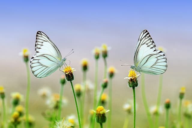
Start by selecting a base color, then explore complementary or analogous colors to build your palette. Mood boards can be helpful — collect images that resonate with your vision and analyze their color schemes. For instance, if you’re aiming for a serene landscape, a palette of soft blues and greens may be suitable. If you’re capturing a bustling city street, a combination of bright red and bold yellow might reflect the vibrant energy of urban life.
Checklist for Pre-Visualizing Color Palettes
- [ ] Select a base color relevant to your theme.
- [ ] Collect images for inspiration.
- [ ] Analyze color relationships in collected images.
- [ ] Create a mood board of your desired palette.


Step 2: Utilizing Natural Light
Lighting is a fundamental aspect of photography, heavily influencing how colors appear. Natural lighting can bring out the vibrancy of colors and produce unique effects depending on the time of day. Early morning and late afternoon, known as the “golden hour,” offers soft, warm light that enhances colors.
Conversely, shooting at midday can lead to harsh shadows, altering the perception of color. Experimenting during different times of the day can yield varied results; for instance, sunset can infuse warm tones into your images, while overcast days offer more subdued hues, perfect for softer portraits. Always consider the direction and quality of light before taking a shot, as this will affect the emotional impact of your photograph.
Step 3: Capturing Color in Composition
Your composition should emphasize your chosen colors, guiding the viewer’s eye through the image. Utilize the rule of thirds to position your colors effectively; placing a striking color in a focal point can draw attention and create interest. When shooting landscapes, consider the horizon’s placement and how it interacts with your color scheme.
Another technique is to create a sense of unity through repetition of colors within your image. This can be achieved by including various elements of the same color within your frame, such as autumn leaves, a multicolored wall, and complementary clothing. This strategy not only ties together the image but also reinforces your entire color palette.
Step 4: Post-Processing Techniques
After capturing your images, post-processing is where you can finely tune your color palette. Tools like Adobe Lightroom or Photoshop can significantly enhance colors in your images. Adjusting the hue, saturation, and luminance settings allows for a targeted approach to achieving the desired mood.
Be careful not to over-saturate colors, which can create an unnatural appearance. Instead, focus on enhancing certain color ranges to support your composition and overall vision. You can also experiment with color grading to add stylistic tones, which can be particularly effective in storytelling. For instance, a warm orange grading may evoke nostalgia, while cooler blues might create a modern or futuristic feel.
Analyzing Artistic Examples
Examining the works of established photographers can provide valuable insights into effective color use. Photographer Annie Leibovitz** is renowned for her ability to convey emotions through distinctive color choices in portrait photography. Observe how she utilizes color to accentuate the subject's personality and the scene's atmosphere.
On the other hand, David LaChapelle incorporates bold and vibrant colors in his surreal scenes, drawing viewers in with visually striking compositions. Understanding these techniques and their effects on your perception will aid immensely in developing your photographic style.
Comparison Table of Color Techniques
| Technique | Strengths | Weaknesses | Best Used In |
|---|---|---|---|
| Complementary Colors | Dynamic contrasts, eye-catching | Overuse can become chaotic | High-energy settings |
| Monochromatic | Harmony, minimalism | Can lack interest if not varied | Calm portraits |
| Triadic Scheme | Balance and visual interest | May be overly busy | Creative projects |
Q: How can I determine the best color palette for my photography?
A: Start by defining the mood and message you want to convey. Explore color theory basics and create mood boards for inspiration.
Q: What role does lighting play in color photography?
A: Lighting significantly affects how colors appear. Experiment with different times of day for varying effects on colors.
Q: How can I enhance my photos' colors without making them unnatural?
A: Use post-processing tools to adjust hue, saturation, and luminance selectively, ensuring colors remain realistic.
Q: Why is composition important in color photography?
A: Good composition highlights key colors and guides the viewer's eye, making your image more impactful.
📺 Resource Video
> 📺 For further exploration: *
📺 Pour aller plus loin : photographic color techniques sur YouTube
Recommended products
Selected by our experts
'Quarto 1' Framed Wall Art 24''x24'' by Ackerman
cb2.com
A stunning piece of framed wall art that can serve as inspiration for color palettes in photography.
Surratt Artistique Liquid Blush Cantaloup
bluemercury.com
This liquid blush brings vibrant color to your photos, perfect for stylistic portrait shots.
Surratt Artistique Blush La Rosee du Soir
bluemercury.com
Offering a natural glow, this blush can be used to accentuate color in a makeup setup for photography purposes.